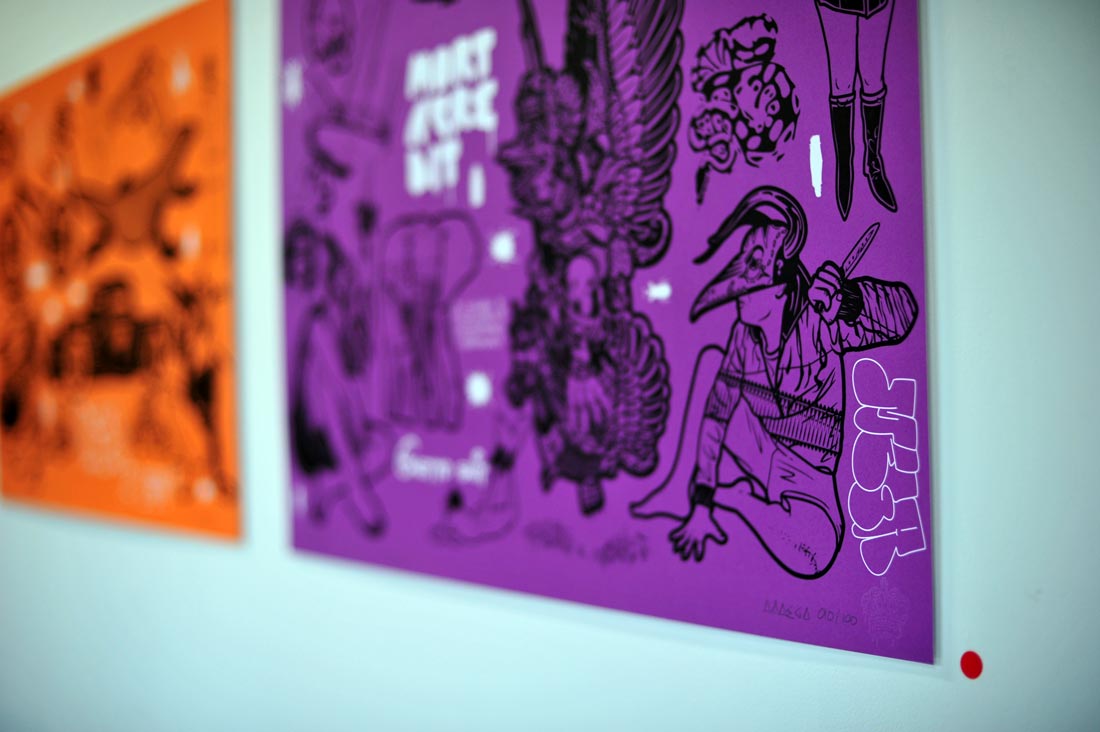
I Just Murdered The Alphabet reviews
I Just Murdered The Alphabet has been reviewed in many magazines, blogs, websites, and various medias.
Here are some of the titles who talked about my art project.
◀ check the complete solo art exhibition.
DESIGN YOU TRUST
Design You Trust is a design community who review new design trends, art events and… Mega new series.
With more than 2 millions page views every month, it’s quite a really good deal to be featured in this blog founded in 2007 by Dmitry Utkin. So I have one thing to say: Thank you Dmitry for creating this great media, and thank you Design You Trust for featuring me!
LIFE LOUNGE
Lifelounge is a digital media and entertainment company based in Australia.
Australia’s No. 1 youth & entertainment website reviewed my new art series, and you can see some exclusive previews of my upcoming show at Sergeant Paper.
COMPLEX
Complex magazine just posted news about Mega new art series.
For over 3 years, I contributed with a full-page in each issue in this cross-cultural lifestyle magazine. A couple of days ago they did a cool post on the art section of their blog.
LOST AT E MINOR
Mega in Lost At E Minor
The famous online publication of inspiring art and pop culture had me talk about my new art series.
With guest contributors such as Shepard Fairey or Ron English, I was quite honored to contribute in selecting cool stuffs to post. From now on, I will add fresh and inspiring news every week. Keep checking the website for more info.
CONTRA
CONTRA is a nice publication that explores urban culture in a slick way.
This network of creative people talks about art (and more) in both a daily forum and a quarterly fashion & lifestyle magazine.
They interview and talk to creative people too. They recently reviewed my new art series, and uploaded a bunch of cool Mega pictures just for you.
Make sure that you check their other photography blog, which is inspiring too.
URBANIST
Urbanist is a french blog about Street culture, music, and art.
Today they posted a nice review of my new art series I Just Murdered The Alphabet. They talk about my background and say cool stuff about me. How do you expect me not to share an article that starts with “Brilliant illustrator, Mega…” 😉
OLYBOP
New interview (in french) on Olybop.
Olybop is a blog talking about culture, graphic design and art. Today they featured my new series I Just Murdered The Alphabet, and we exchanged a few words.
SIX AND 5
My friends from Six And Five just made a nice post about my artwork series.
Remember, Sixand5 showed me some love in the past, and have always been supportive with my artworks.
PROTEUS MAG
Proteus mag chose me as their artist of the day.
This inspirational online magazine managed by Dustin Parker putted me on the front page. Thanks!
TREND HUNTER
I Just Murdered The Alphabet turns into a trend.
CNN, MTV, Kanye West, Paris Hilton, MTV and much more trend-setters have cited Trendhunter as one of the biggest source of inspiration on the web. Oh, and they like my work too 😉
DISASSOCIATED
Consortium of the cool.
Disassociated was founded by John Lampard, who started this great website about pop culture, design art, and more in 1997.
DR COTTON
Thanks Doc, it’s sick!
I met the founder od Dr Cotton when I was in Melbourne for my previous touring exhibition. The guys were really cool, and even bought me some art prints. One year later they promote my new series, blog about it, tweet about it, facebook about it… Every day!
LEZILUS
My french representative is awesome.
Lezilus is my french representative. He’s a wonderful person who allows me to reach corporate customers in all the french-speaking countries. We work together since many years, and it has always been a great pleasure for me to deal with such a professional person. Thank you Lezilus!
INTERVIEW WITH DR COTTON
Dr Cotton has published a huge Mega interview.
In this interview, I talk about my art inspirations, my artistic background, and introduces the concepts behind my new series of artworks.
The Australian apparel brand also publish a daily Mega news on their Facebook and Twitter accounts.
I really appreciate the support.
They have already posted a review on my series of handmade drawings.
This is still a secret, but I may soon produce an artwork printed on T-shirt in collaboration with the Australian clothing brand.
Stay tuned for more information.
YOUR ART HERE
You Art Here is a French website that presents hot and fresh art news.
They interviewed me last year to talk about my 2011 touring exhibition.
Today they decided to support my artworks, and they present an exclusive portfolio based on my art series I Just Murdered The Alphabet.
SUPERLATIVE
Superlative is an art blog based in Germany.
They have published a really long interview in which I talk about my artworks and give more information about the concept behind La Société Des Griffeurs.
FRINGE BENEFITS
Fringe Benefit is an art website from Adelaide, Australia.
They talk about anything related to musical venues and art news.
They have recently reviewed my new series of drawings, with nice words to describe my artworks.
Thank you guys!
GRAPHIC ART NEWS
Last but not least, Graphicart News has published a new I Just Murdered The Alphabet review.
The art blog focusses on design and photography, and offers a portfolio with pictures of my latest artworks.
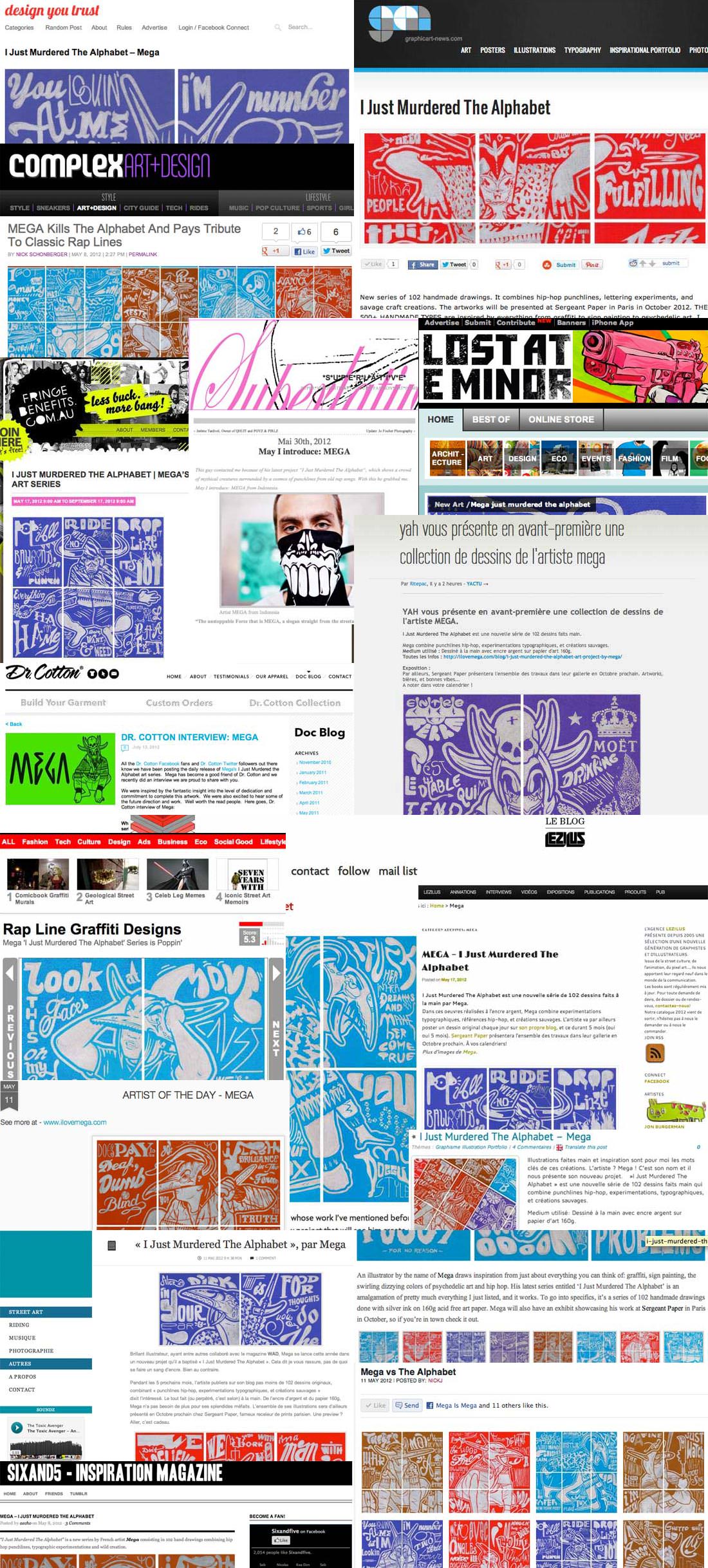
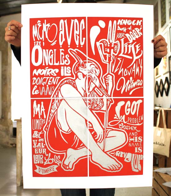
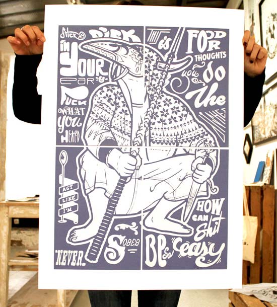
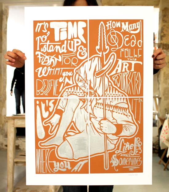
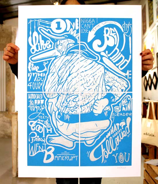
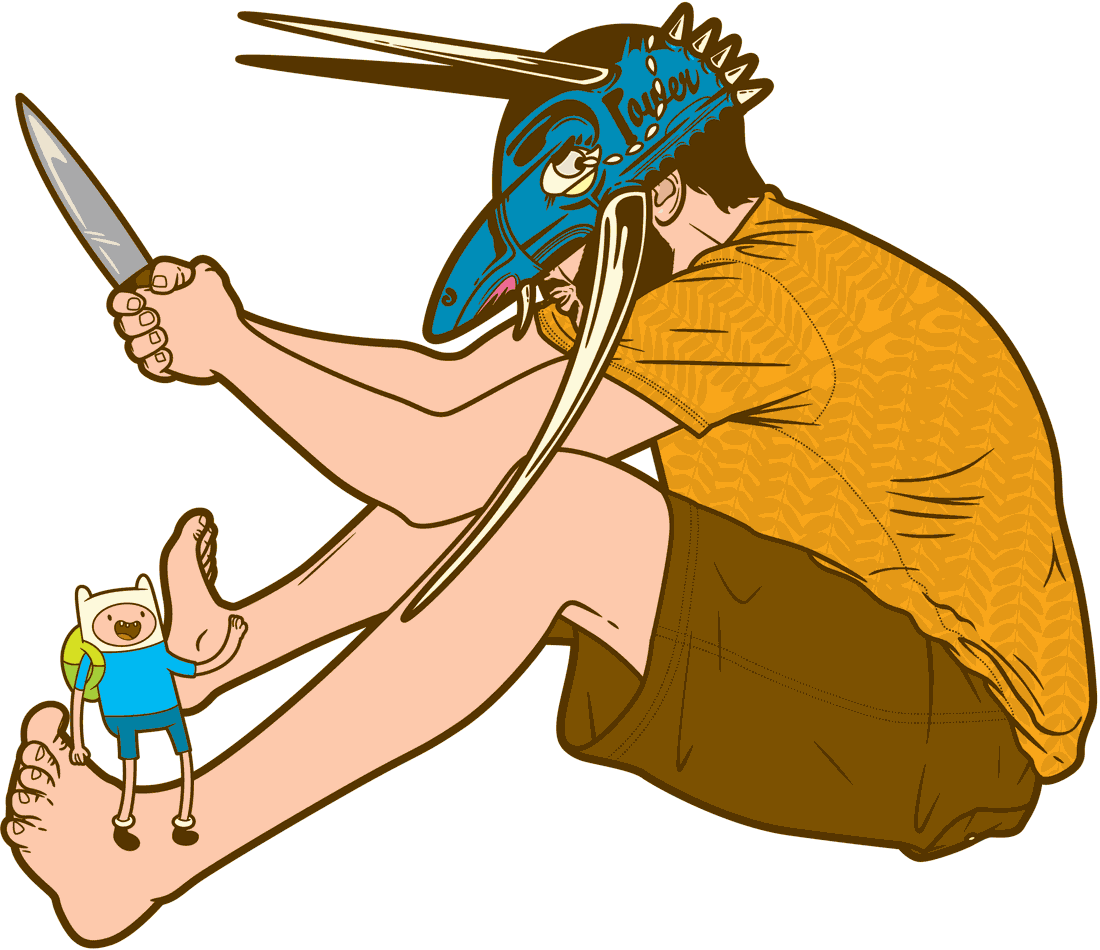
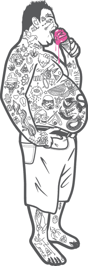
Collection of reviews I received online for my art series I Just Murdered The Alphabet
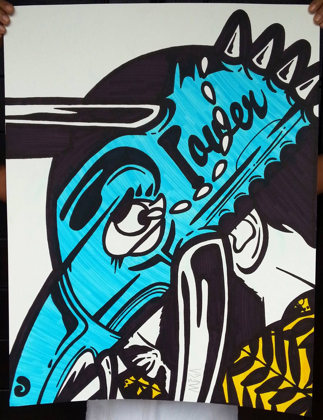
Don’t forget to have a look on the new drawings I have created for my upcoming exhibition.
The exhibition will be presented in Paris next October at the Sergeant Paper gallery.
You may also remember the gallery, because I presented my art series Longing To Be Knotted Together in the same place last year for the Paris stop of my touring exhibition.
I would be happy to answer your questions for more I Just Murdered The Alphabet reviews.
Feel free to use my contact form to send me a message.
Let’s talk soon!